Contact me!
Typically responds within 2- 3 business days
Thank you! Your submission has been received!
Oops! Something went wrong while submitting the form.
Typically responds within 2- 3 business days
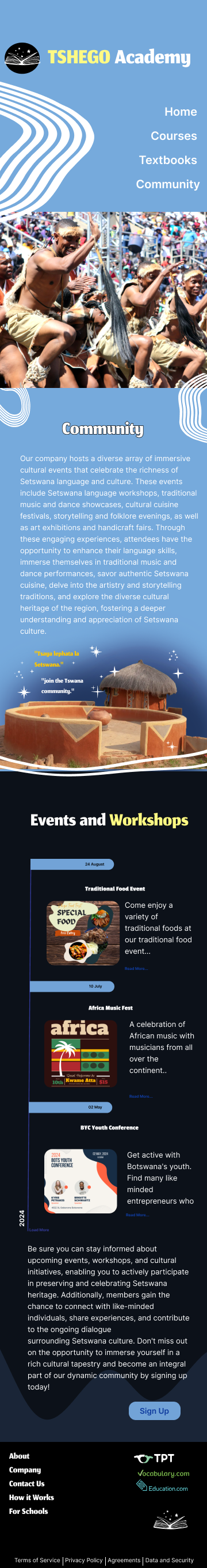
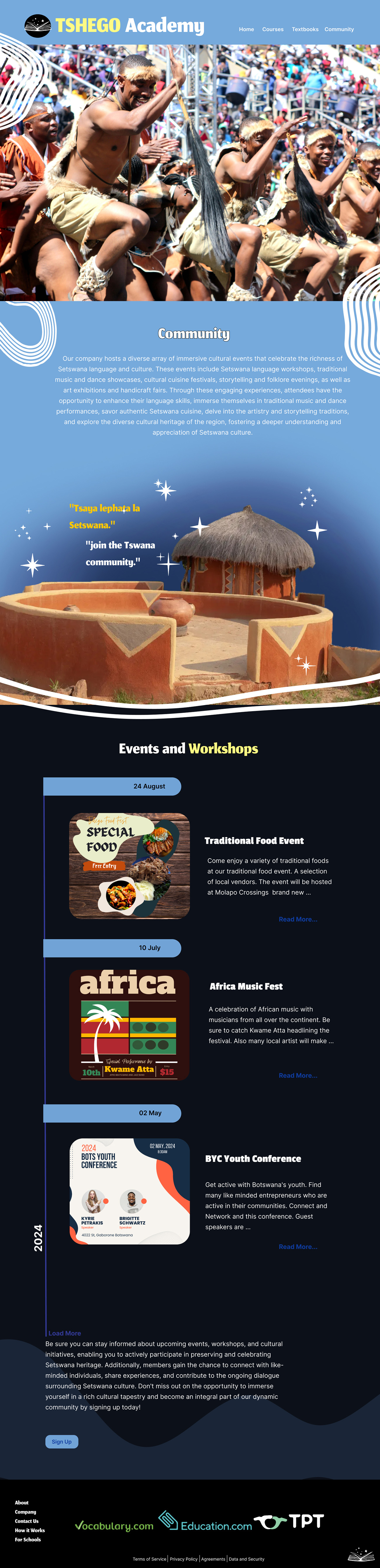
Thsego Academy is a Language learning Academy based in Gaborone, Botswana.
While Setswana is taught in school in schools there are not too many resources for those who did not get the opportunity to learn in school or at home. Foreigners who are looking for a way to learn Setswana may not know where to look to develop their language skills. Third-culture kids or even Batswana children who may primarily speak English at home can be looking for a place to supplement and develop their speaking skills.
The website offers a potential student everything they need to know to connect to the language learning academy as well as a safe space to connect with Setswana culture. The website is to get people excited learning or improving their Setswana skills.

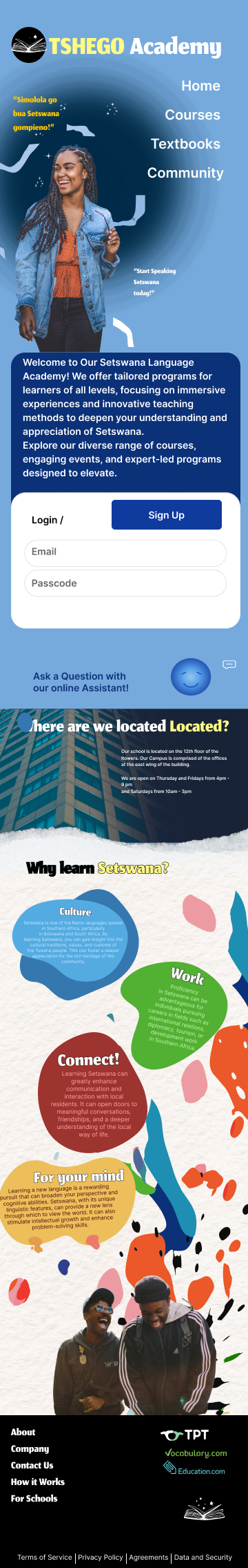
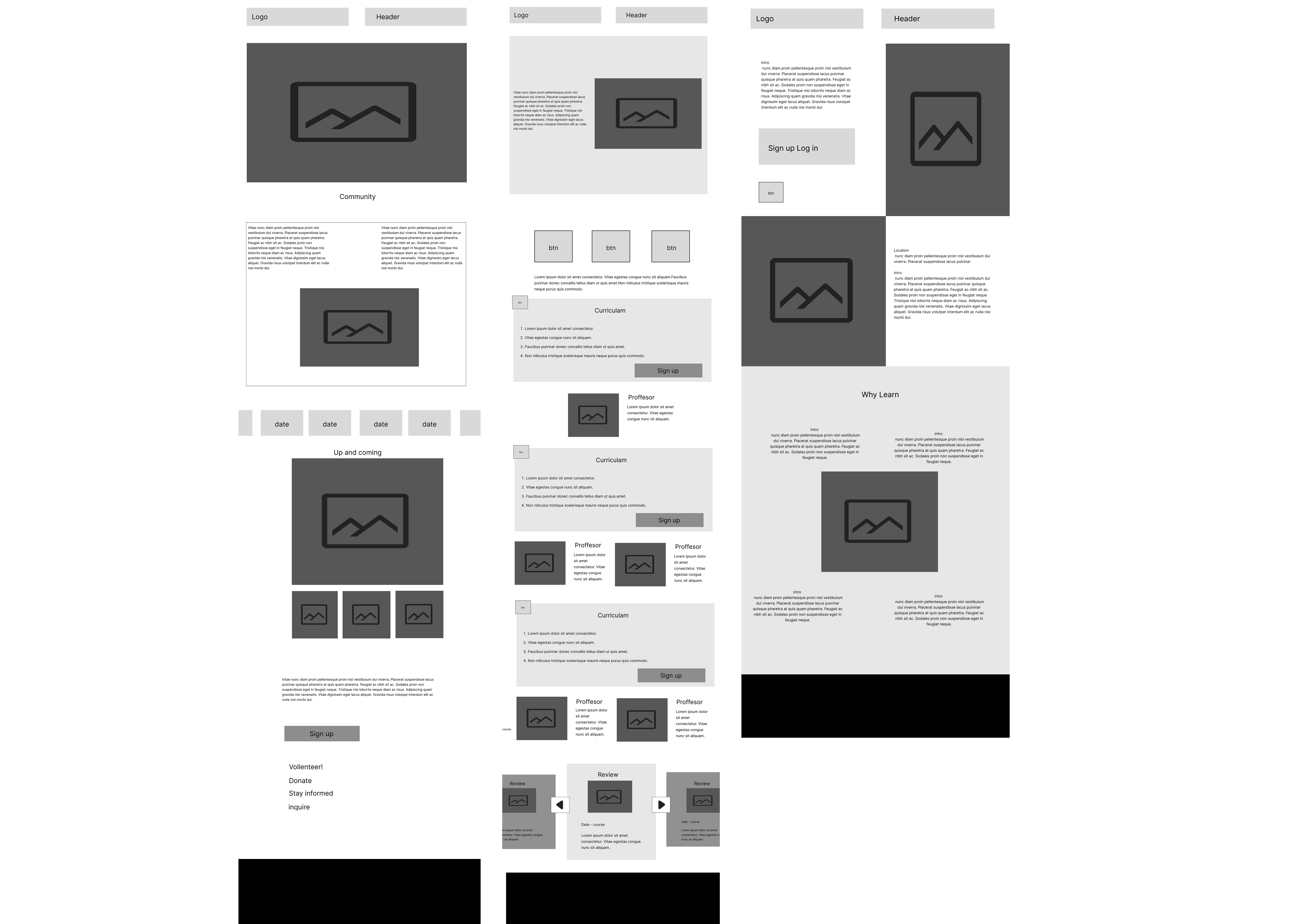
The Tsego Language Learning Academy website was designed as a supplementary resource to support the physical academy. Its main purpose was to help users easily find a course that suits them and sign up with minimal hassle. The content of most of the pages was fairly minimal. Its key Pages included :
The website is designed to be straightforward, with key features like the sign-up form prominently displayed on the front page for easy access. Due to the minimal content on some pages, I had the flexibility to creatively arrange the content, creating an attractive and easy-to-use layout.

Designing with balance:
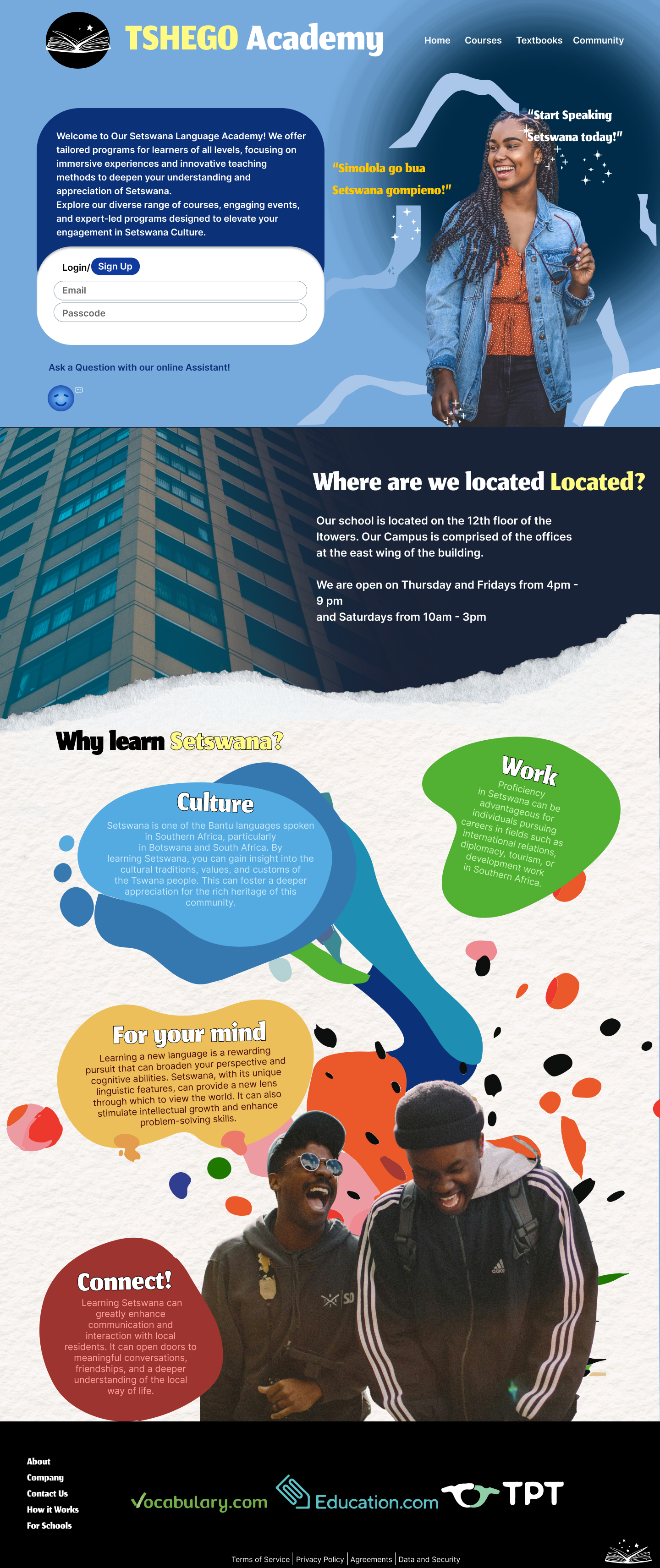
The challenge of limited content sparked the opportunity to create a dynamic layout that would intrigue without overwhelming. I focused on building an information hierarchy that prioritized clarity and usability while maintaining a visually engaging experience. The goal was to encourage exploration through intuitive navigation and interactive design, guiding users seamlessly from one section to the next.
Graphics that speak: merging stock photos with playful design.
To add visual interest without cluttering the experience, I merged stock photos with custom playful graphics. By overlaying graphics on the photos, I created a more dynamic and engaging visual language, infusing a sense of fun and energy. This approach allowed me to maintain the realism of the stock images while enhancing them with illustrative elements that added personality and made the design more memorable. The playful graphics complemented the content and kept the user experience fresh and visually appealing, encouraging further exploration.
Identity in every detail: creating a lively, cohesive look.
In terms of branding, I drew from the Botswana flag to establish a unique color palette, balancing cool blue with energetic yellow for contrast. These colors were used sparingly but effectively to inject vibrancy while keeping the layout clean and user-friendly. To prevent visual overload, I chose simple, legible fonts that complemented the design without competing with the bold graphics, ensuring that the typography remained functional for readability.